
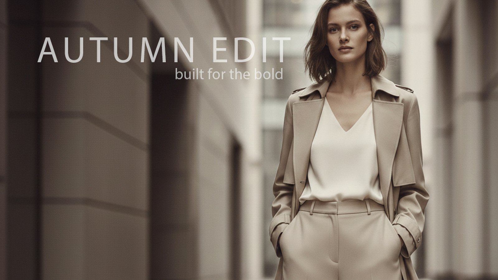
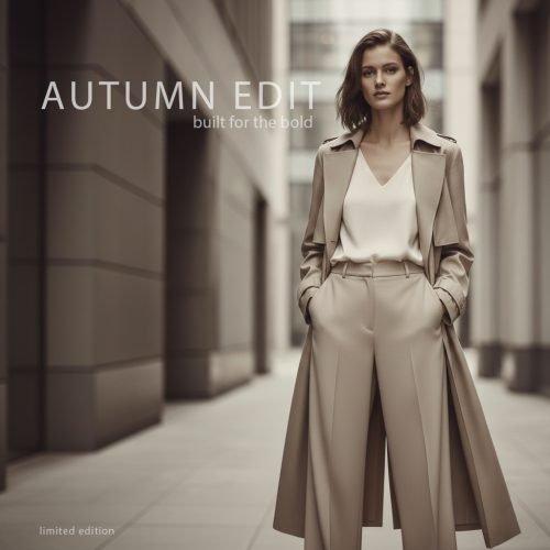
Autumn Edit began as an exploration of how restraint, composition, and typography can transform a simple fashion image into a polished editorial campaign.
The goal was not to create a loud advertisement filled with competing elements. Instead, I wanted the final piece to feel refined, modern, and confident—the kind of visual that could belong in a fashion magazine, seasonal campaign, or premium social media launch.
Establishing the Creative Direction
The first step was defining the mood.
Rather than using the familiar autumn colours of orange, red, and yellow, I chose a more sophisticated neutral palette. The beige clothing, soft architectural background, and muted lighting create an understated seasonal atmosphere without relying on obvious fall imagery.
The model’s outfit became the main visual anchor. The long coat, wide-leg trousers, and clean silhouette communicate confidence while maintaining the minimalist style of the campaign.
The overall direction focused on:
- Neutral and muted tones
- Modern architectural surroundings
- Soft, editorial lighting
- Clean fashion styling
- A calm but confident atmosphere
This gave the image a premium feel while leaving enough visual space for the typography.
Creating the Composition
The model was positioned toward the right side of the frame rather than directly in the centre. This was an important choice because it created a large area of negative space on the left.
That open space gave me room to introduce the campaign title without covering the clothing or distracting from the subject.
The surrounding architecture also helped frame the model. The vertical lines of the hallway guide the viewer’s attention toward her, while the blurred background creates depth and keeps the focus on the fashion.
Although the composition appears simple, the placement of each element was deliberate. The model, title, tagline, and smaller supporting text all needed to feel connected without making the design crowded.
Developing the Typography
The main headline, AUTUMN EDIT, was designed to feel similar to the typography used in contemporary fashion editorials.
I used uppercase lettering with a thin weight and wide character spacing. This allowed the title to have a strong presence without feeling heavy or overpowering.
The headline was placed in the upper-left area of the image, using the available negative space while balancing the model on the opposite side.
Beneath it, the tagline “built for the bold” was added at a much smaller size. The lighter weight and reduced visual emphasis created a clear hierarchy:
AUTUMN EDIT introduces the campaign.
Built for the bold provides its attitude.
The small “limited edition” message was positioned near the bottom-left corner. It acts as a subtle finishing detail rather than another major headline.
Refining the Design
The refinement stage was largely about reducing rather than adding.
The original typography needed to feel elegant, so the headline weight was reduced and the tracking was increased slightly. The opacity was also softened so the text would sit naturally within the image instead of appearing pasted over it.
The tagline was made smaller, lighter, and more restrained. Its placement was adjusted until it supported the title without competing with it.
The “limited edition” text was anchored near the bottom-left edge to create another point of visual interest and help balance the full composition.
These were small adjustments, but they made a major difference. Minimal design leaves very little room for weak spacing or inconsistent alignment. When there are only a few elements on the page, every detail becomes more noticeable.
Maintaining a Restrained Colour Palette
One of the strongest parts of the final image is its consistency.
The clothing, background, lighting, and typography all remain within a narrow range of warm neutral colours. Nothing feels disconnected from the overall visual direction.
The white text provides enough contrast to remain readable, but it is slightly softened so it does not become the brightest or most dominant part of the design.
This restraint helps the campaign feel premium. Instead of attempting to capture attention through aggressive colour or oversized graphics, the image depends on composition, styling, and atmosphere.
The Final Result
The completed Autumn Edit campaign combines fashion imagery with clean editorial design.
The finished visual could be adapted for:
- A seasonal fashion launch
- Social media advertising
- Website hero artwork
- Magazine or lookbook promotion
- Digital campaign branding
- Motion graphics or animated fashion content
More importantly, the project demonstrates how a focused concept can be strengthened through careful typography, spacing, and visual hierarchy.
The design does not need dozens of elements to communicate its message. It uses one strong image, one clear headline, and a few carefully positioned supporting details.
Sometimes the most effective creative decision is knowing what to leave out.
Project Summary
Project: Autumn Edit
Category: Editorial Fashion Design
Creative Direction: Minimal, modern, and sophisticated
Key Focus: Composition, typography, visual hierarchy, and restrained colour
Campaign Line: Built for the bold