
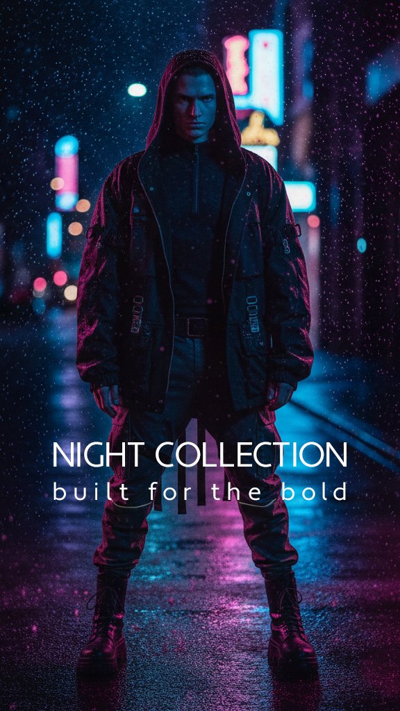
Night Collection is an AI-assisted fashion campaign built around a cinematic nighttime atmosphere, bold streetwear, neon lighting, and adaptable social media layouts.
The goal was to create something that felt more like a scene from a futuristic fashion film than a traditional clothing advertisement. The campaign needed to feel dramatic and visually striking while still presenting the clothing clearly.
AI image generation played an important role in producing the models, clothing concepts, lighting, and urban environments. However, the project involved much more than generating a single image. It required concept development, prompt refinement, visual selection, typography, layout design, format adaptation, and final campaign presentation.
Developing the Initial Concept
The project began with a simple creative direction: a dark fashion collection photographed on a rainy city street at night.
I wanted the campaign to feel:
Cinematic
Urban
Fashion-forward
Slightly futuristic
Dark and mysterious
Bold without becoming chaotic
Rather than using a conventional studio or daytime environment, I chose a neon-lit city setting. Wet pavement, falling rain, blurred signs, and reflected light would provide movement and atmosphere while helping the dark clothing stand out.
The campaign name Night Collection naturally developed from this direction.
The supporting line, “built for the bold,” added a clear attitude to the brand. It positioned the collection as something designed for people who are confident, independent, and comfortable standing out.
Using AI to Build the Visual World
AI image generation was used to explore the fashion styling, models, poses, environment, and lighting.
This made it possible to develop a complete campaign look without requiring a physical location, wardrobe department, models, lighting crew, or nighttime photo shoot.
The AI-generated imagery needed to include several consistent elements:
A rainy city street at night
Magenta and cyan lighting
Dark modern clothing
Wet pavement with reflected neon
Direct, confident poses
Cinematic depth and background blur
A premium editorial-fashion appearance
Generating the images was not a one-step process. Different descriptions, compositions, outfits, and poses had to be explored before finding results that felt suitable for the campaign.
AI can create visually impressive images quickly, but the output still needs creative direction. The real work comes from knowing what the campaign should communicate, recognizing which results support that idea, and refining the visual direction when they do not.
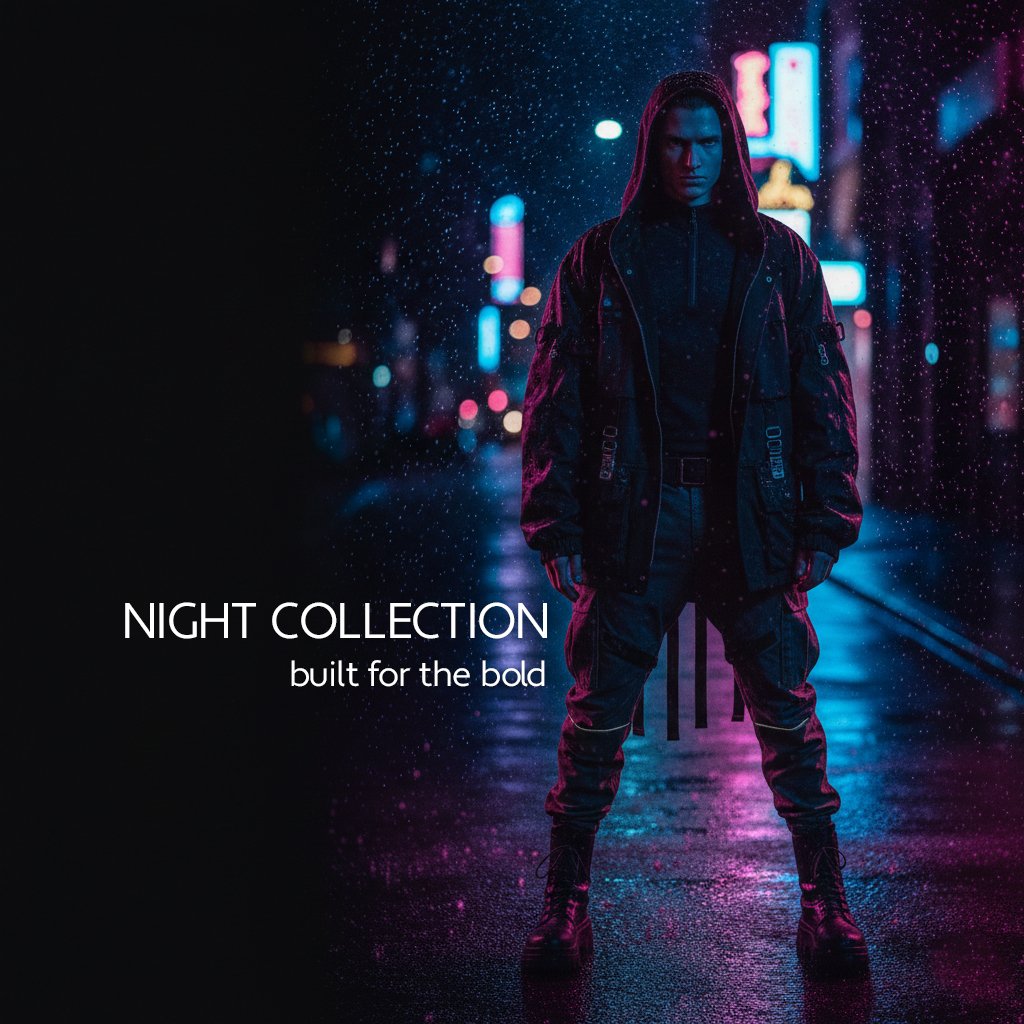
Creating a Consistent Male Look
The male version of the campaign was designed around a dark utility-streetwear style.
The outfit includes a hooded jacket, layered black clothing, cargo-inspired trousers, belts, straps, and heavy boots. His stance is centred, direct, and controlled.
The hood helps frame the face and strengthens the mysterious quality of the image. Blue light falls across one side of the face while magenta lighting defines the opposite edge of the clothing.
Because most of the outfit is black, the coloured lighting was important. Without it, many of the clothing details could have disappeared into the background.
The male image was intended to communicate:
Strength
Control
Mystery
Modern streetwear
Urban confidence
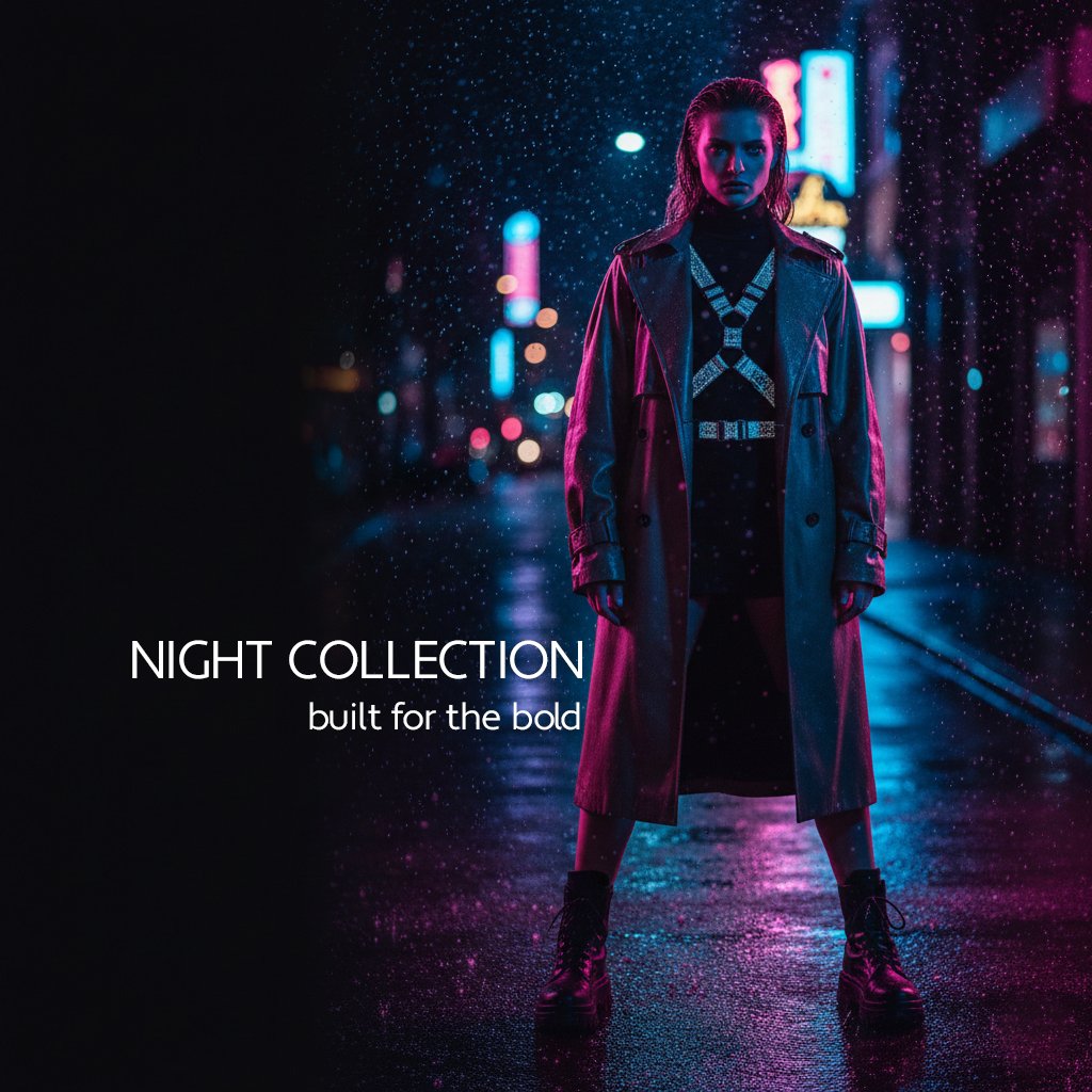
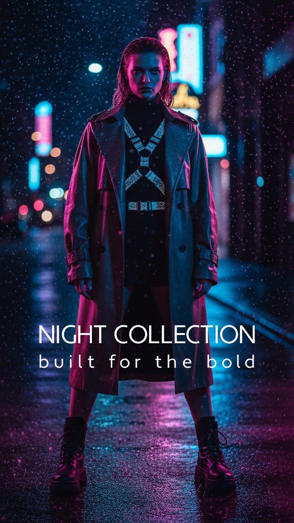
Developing the Female Look
The female version uses the same environment and colour palette but introduces a different fashion silhouette.
Her outfit includes a long structured coat, fitted dark clothing, metallic harness-inspired details, a belt, and heavy platform boots.
The reflective details across the torso create a strong focal point and catch the surrounding neon light. Her long coat also gives the composition a more editorial and dramatic shape.
Although the male and female outfits are different, they clearly belong to the same collection because they share:
Similar lighting
Matching environments
Consistent colour grading
Strong front-facing poses
Dark fashion styling
The same campaign typography
Maintaining this consistency was essential. The goal was to create a recognizable campaign system rather than several unrelated fashion images.
Designing the Vertical Campaign Posters
The 9:16 versions were created for vertical platforms such as:
Instagram Reels
Instagram Stories
TikTok
YouTube Shorts
Mobile advertisements
The tall format allowed both models to be shown from head to toe. This was important because the clothing, boots, coat length, and full silhouette were central to the campaign.
Each model was positioned near the centre of the composition, creating the feeling of a fashion poster.
The title NIGHT COLLECTION was placed across the lower section of the image, with built for the bold underneath.
The typography was kept clean and minimal because the background already contained rain, reflections, signs, and coloured lighting. A more decorative typeface would have competed with the imagery.
The white lettering provides contrast while maintaining the premium editorial appearance of the campaign.
Adapting the Designs for Square Formats
The square versions were not created by simply cutting the top and bottom from the vertical posters.
Doing that would have removed important parts of the models and created an awkward composition.
Instead, the square artwork was redesigned around a different layout.
The models were moved toward the right side of the frame, while a dark area was developed on the left. This negative space created room for the campaign title without covering the clothing.
The square designs follow a clear visual path:
The viewer sees the title on the left.
Their attention moves toward the model.
The neon street draws the eye deeper into the image.
This format works well for Instagram posts, portfolio galleries, website thumbnails, advertisements, and campaign previews.
Using Negative Space as Part of the Design
The dark section on the left side of the square images serves an important purpose.
It gives the typography room to breathe and prevents the composition from feeling overcrowded.
The right side of each image already contains a large amount of visual information:
The model
Detailed clothing
Rain particles
Neon signs
Reflections
City lights
Balancing that detail with a quieter area makes the overall design feel more controlled.
Negative space is not wasted space. In this campaign, it supports readability, creates balance, and gives the brighter colours more impact.
Establishing the Typography
The campaign typography needed to feel modern, fashionable, and easy to read.
The main title uses clean uppercase lettering with generous spacing:
NIGHT COLLECTION
The tagline appears in smaller lowercase type:
built for the bold
This creates a simple visual hierarchy. The collection name receives the most attention, while the supporting line adds personality without overpowering the design.
The same typography was used across the male and female images to maintain brand consistency.
Even though the tagline was also used in the earlier Autumn Edit project, it creates a different emotional response here.
In the softer neutral campaign, the line feels refined and confident.
In Night Collection, it feels more rebellious, intense, and urban.
The imagery surrounding the words changes how they are interpreted.
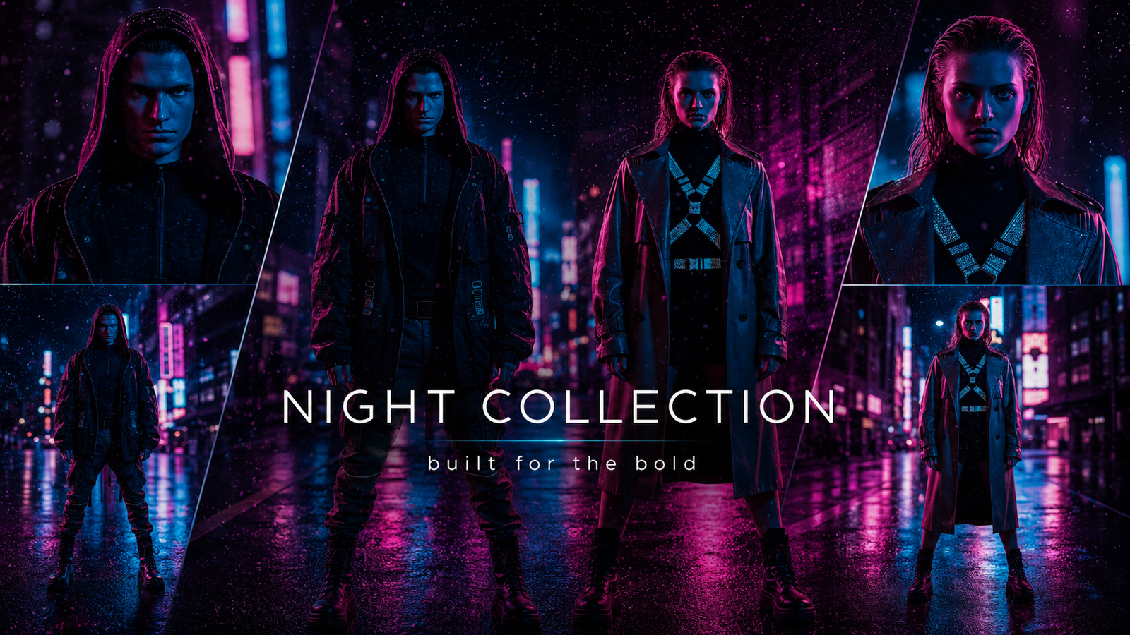
Creating the 16:9 Feature Cover
After completing the vertical and square designs, the strongest elements were brought together into a widescreen feature image.
The 16:9 collage was designed for use as:
A blog cover
A portfolio hero image
A website banner
A YouTube thumbnail or feature graphic
A campaign presentation cover
The feature image combines the male and female models with additional close-up and full-body views. Angled panel divisions create energy while keeping the models separated clearly.
The central full-body figures serve as the primary focus, while the smaller side panels provide supporting details and reinforce the feeling of a complete fashion collection.
The title was placed prominently across the centre:
NIGHT COLLECTION
The smaller tagline appears underneath:
built for the bold
This allowed the cover to function as both a collage and a clear campaign introduction.
The Importance of Human Creative Direction
Although AI generated much of the original imagery, the campaign still depended on human decisions at every stage.
Those decisions included:
Choosing the campaign theme
Defining the emotional tone
Developing the fashion direction
Selecting the strongest AI generations
Rejecting results that did not fit
Refining compositions
Positioning the typography
Adapting the artwork for different formats
Maintaining visual consistency
Creating the final feature collage
AI can generate options, but it does not automatically create a strong campaign.
A successful campaign requires someone to decide what belongs, what does not, what needs to change, and how every visual should support the same idea.
For this project, AI acted as a production and experimentation tool. Creative direction turned the individual outputs into a connected body of work.
Challenges of Working With AI Imagery
AI-assisted design also introduces challenges.
The model’s clothing, pose, facial features, lighting, and environment can change unexpectedly between generations. Small visual inconsistencies may make two otherwise strong images feel as though they belong to different campaigns.
Maintaining consistency required careful selection and a clearly defined creative direction.
Typography was another important consideration. Rather than relying on generated text inside the images, the campaign title and tagline needed to be handled as intentional design elements.
This made the wording clearer, improved readability, and gave the finished campaign a more professional presentation.
Final Result
The completed Night Collection project includes:
A vertical male fashion poster
A square male campaign layout
A vertical female fashion poster
A square female campaign layout
A 16:9 feature-cover collage
Together, these pieces demonstrate how an AI-generated concept can be expanded into a consistent digital fashion campaign.
The project combines AI image generation with creative direction, prompt development, image selection, typography, composition, branding, and platform-specific design.
The result is not simply a collection of generated pictures. It is a coordinated visual campaign designed to remain recognizable across different models, outfits, dimensions, and promotional uses.
Project Summary
Project: Night Collection
Category: AI-assisted fashion campaign
Creative direction: Cinematic, urban, futuristic, and bold
Formats: 9:16 vertical, 1:1 square, and 16:9 widescreen
Campaign line: Built for the bold
Primary focus: AI image generation, art direction, typography, format adaptation, campaign consistency, and digital presentation