
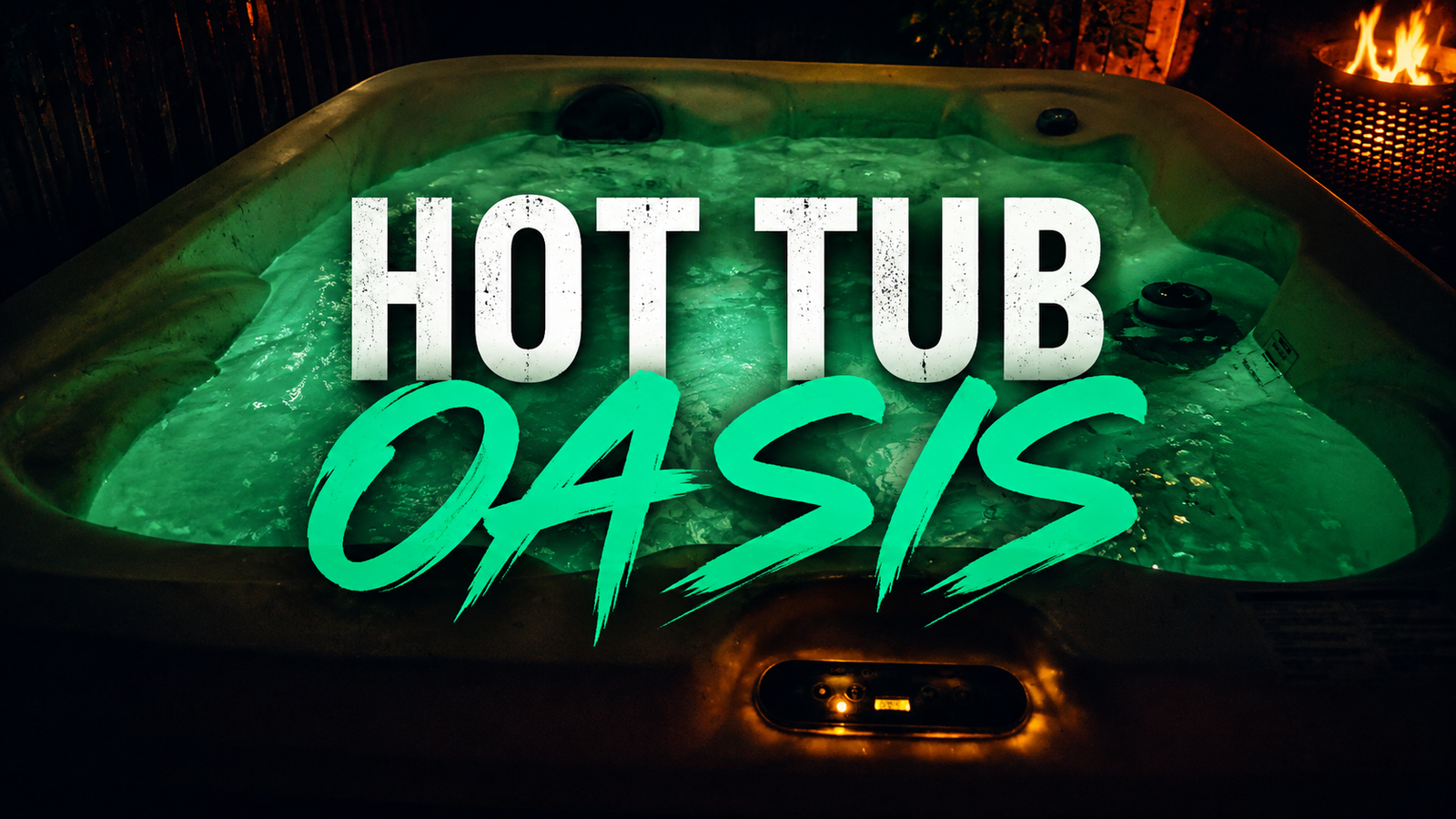
A commercial-style promotional video combining filming, editing, color grading and sound design to showcase Hot Tub Oasis and its products.
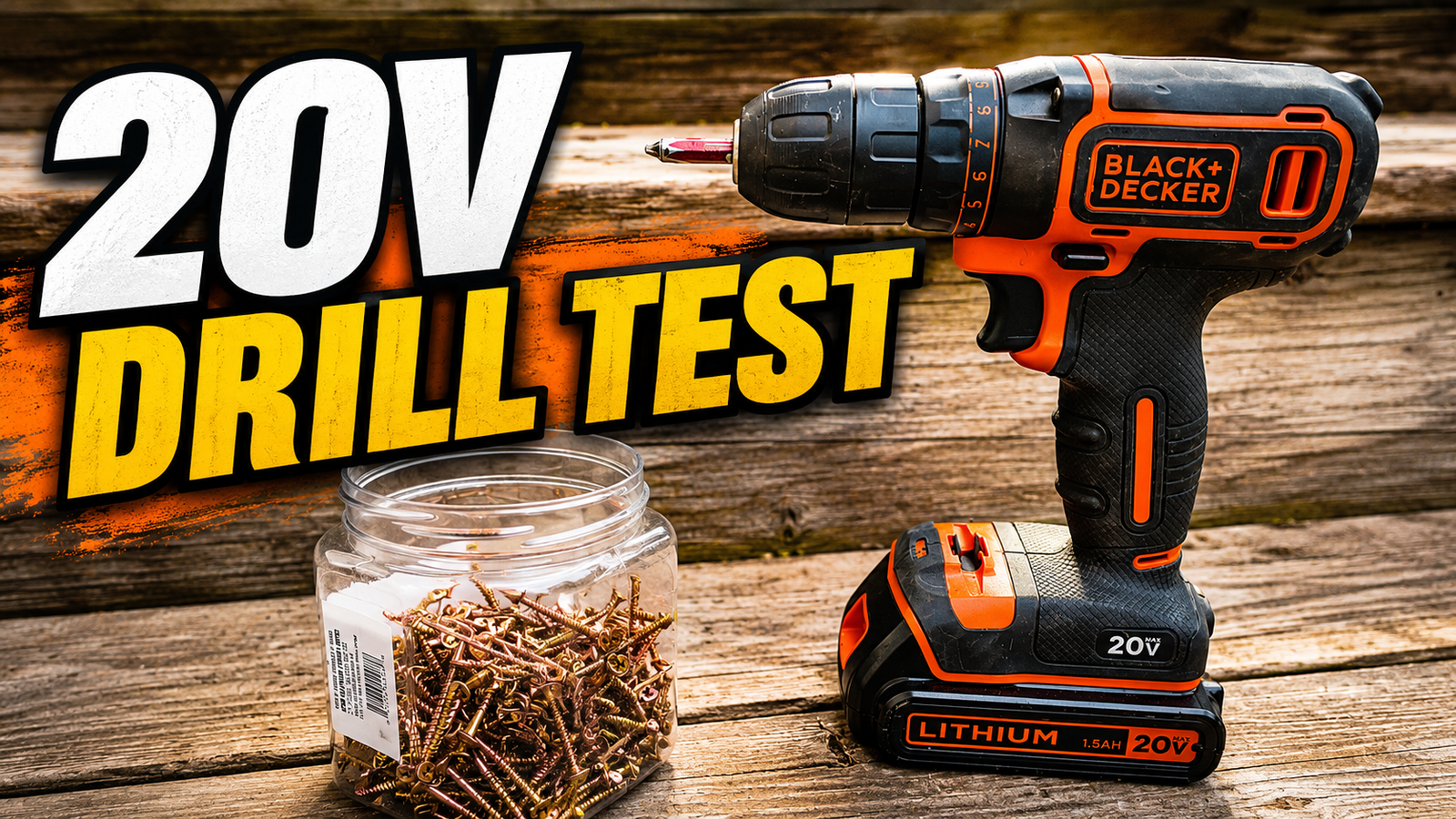
Product Commercial — Drill Spec Video
A fast-paced product-focused spec commercial built around detail shots, strong pacing, sound design and polished editing.
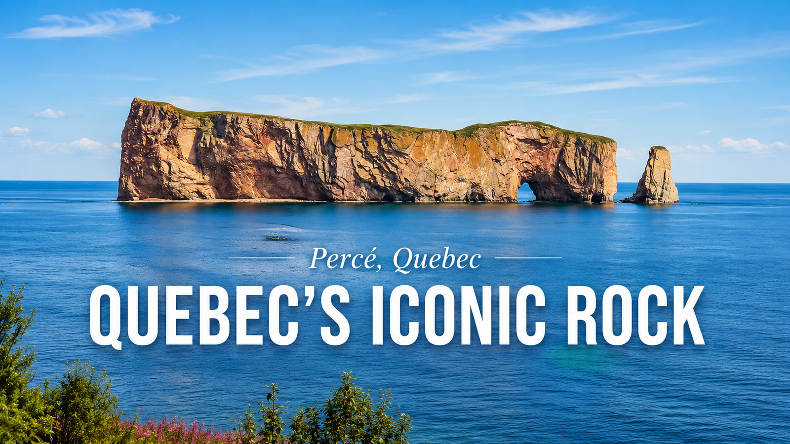
Percé — Cinematic Travel Story
A cinematic travel edit combining location footage, pacing, sound design and animated map graphics to create a short visual story around Percé.
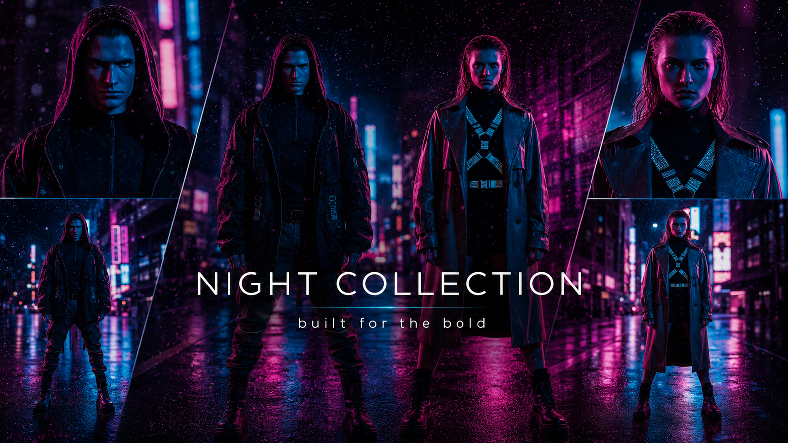
Creating “Night Collection”: A Neon Fashion Campaign Built for Multiple Formats
Night Collection — Fashion Campaign
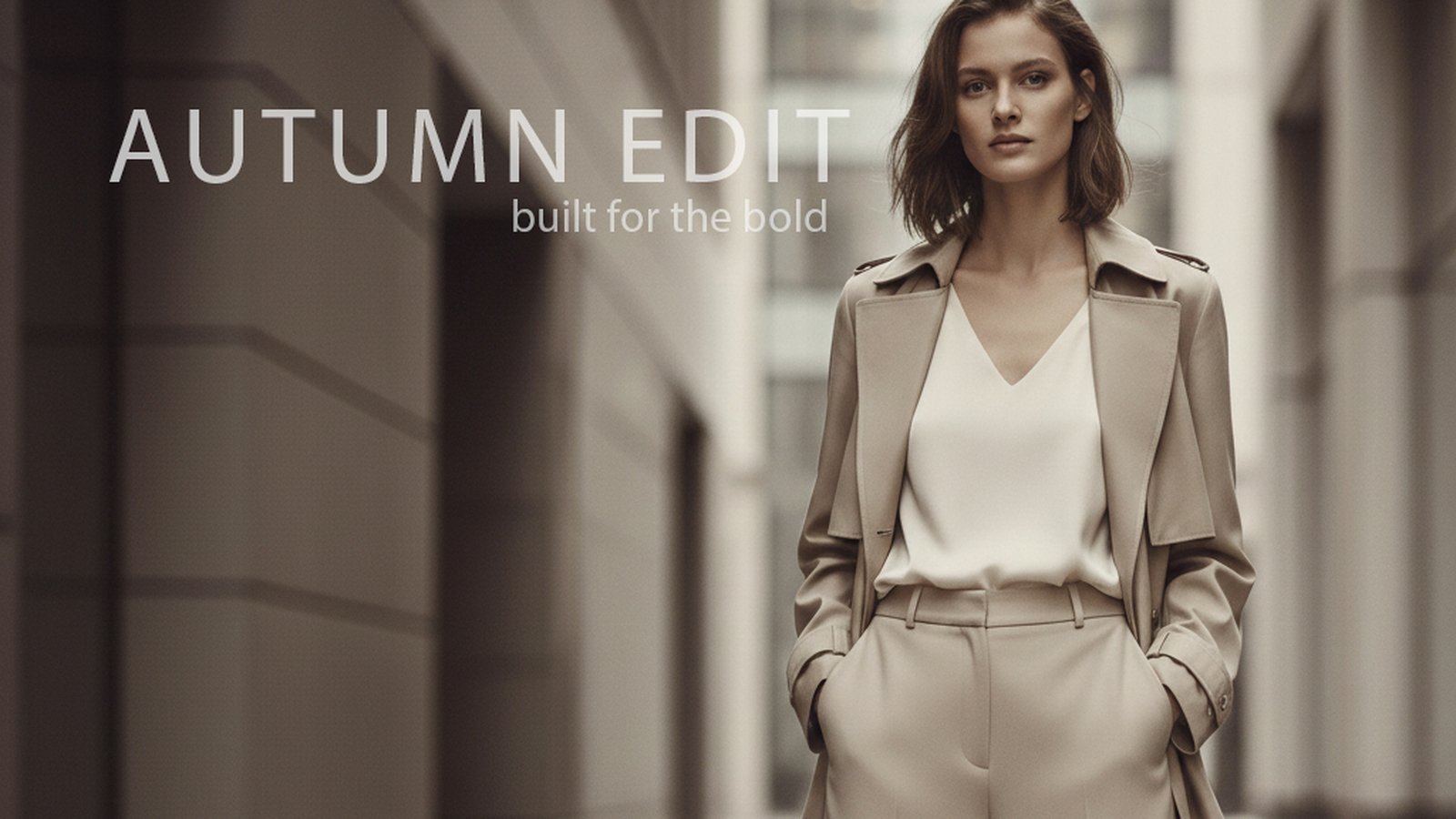
Creating “Autumn Edit”: Building a Minimal Editorial Fashion Campaign
Autumn Edit began as an exploration of how restraint, composition, and typography can transform a simple fashion image into a polished editorial campaign. The goal was not to create a loud advertisement filled with competing elements. Instead, I wanted the final piece to feel refined, modern, and confident—the kind of visual that could belong in a fashion magazine, seasonal campaign, or premium social media launch. Establishing the Creative Direction The first step was defining the mood. Rather than using the familiar autumn colours of orange, red, and yellow, I chose a more sophisticated neutral palette. The beige clothing, soft architectural background, and muted lighting create an understated seasonal atmosphere without relying on obvious fall imagery. The model’s outfit became the main visual anchor. The long coat, wide-leg trousers, and clean silhouette communicate confidence while maintaining the minimalist style of the campaign. The overall direction focused on: Neutral and muted tones Modern architectural surroundings Soft, editorial lighting Clean fashion styling A calm but confident atmosphere This gave the image a premium feel while leaving enough visual space for the typography. Creating the Composition The model was positioned toward the right side of the frame rather than directly in the centre. This was an important choice because it created a large area of negative space on the left. That open space gave me room to introduce the campaign title without covering the clothing or distracting from the subject. The surrounding architecture also helped frame the model. The vertical lines of the hallway guide the viewer’s attention toward her, while the blurred background creates depth and keeps the focus on the fashion. Although the composition appears simple, the placement of each element was deliberate. The model, title, tagline, and smaller supporting text all needed to feel connected without making the design crowded. Developing the Typography The main headline, AUTUMN EDIT, was designed to feel similar to the typography used in contemporary fashion editorials. I used uppercase lettering with a thin weight and wide character spacing. This allowed the title to have a strong presence without feeling heavy or overpowering. The headline was placed in the upper-left area of the image, using the available negative space while balancing the model on the opposite side. Beneath it, the tagline “built for the bold” was added at a much smaller size. The lighter weight and reduced visual emphasis created a clear hierarchy: AUTUMN EDIT introduces the campaign. Built for the bold provides its attitude. The small “limited edition” message was positioned near the bottom-left corner. It acts as a subtle finishing detail rather than another major headline. Refining the Design The refinement stage was largely about reducing rather than adding. The original typography needed to feel elegant, so the headline weight was reduced and the tracking was increased slightly. The opacity was also softened so the text would sit naturally within the image instead of appearing pasted over it. The tagline was made smaller, lighter, and more restrained. Its placement was adjusted until it supported the title without competing with it. The “limited edition” text was anchored near the bottom-left edge to create another point of visual interest and help balance the full composition. These were small adjustments, but they made a major difference. Minimal design leaves very little room for weak spacing or inconsistent alignment. When there are only a few elements on the page, every detail becomes more noticeable. Maintaining a Restrained Colour Palette One of the strongest parts of the final image is its consistency. The clothing, background, lighting, and typography all remain within a narrow range of warm neutral colours. Nothing feels disconnected from the overall visual direction. The white text provides enough contrast to remain readable, but it is slightly softened so it does not become the brightest or most dominant part of the design. This restraint helps the campaign feel premium. Instead of attempting to capture attention through aggressive colour or oversized graphics, the image depends on composition, styling, and atmosphere. The Final Result The completed Autumn Edit campaign combines fashion imagery with clean editorial design. The finished visual could be adapted for: A seasonal fashion launch Social media advertising Website hero artwork Magazine or lookbook promotion Digital campaign branding Motion graphics or animated fashion content More importantly, the project demonstrates how a focused concept can be strengthened through careful typography, spacing, and visual hierarchy. The design does not need dozens of elements to communicate its message. It uses one strong image, one clear headline, and a few carefully positioned supporting details. Sometimes the most effective creative decision is knowing what to leave out. Project Summary Project: Autumn EditCategory: Editorial Fashion DesignCreative Direction: Minimal, modern, and sophisticatedKey Focus: Composition, typography, visual hierarchy, and restrained colourCampaign Line: Built for the bold
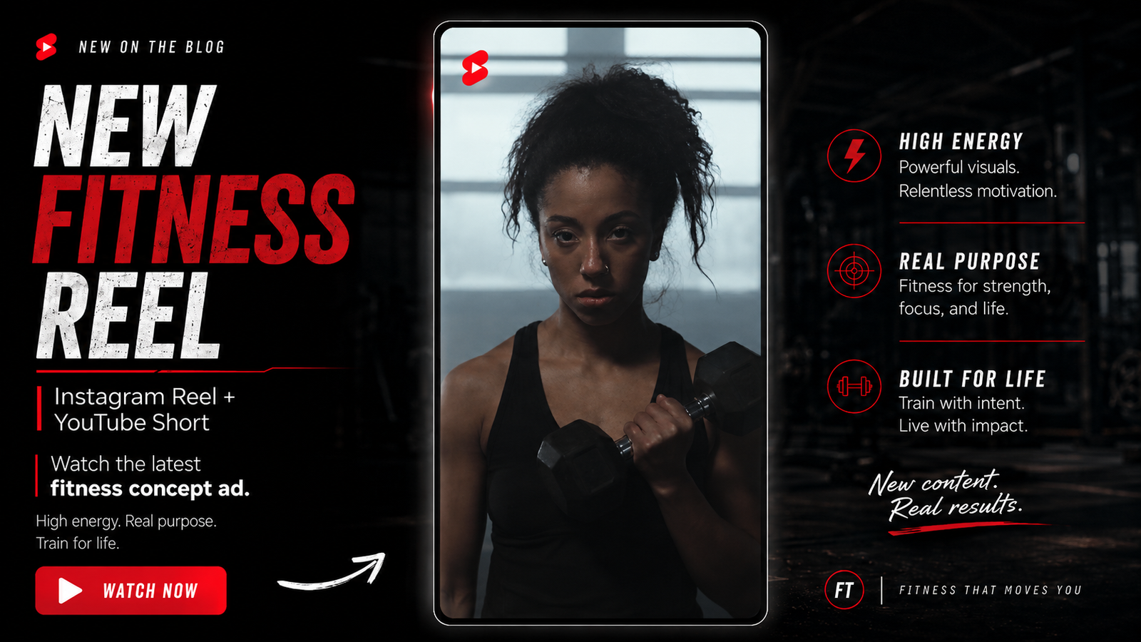
Train for Life: Creating a High-Energy Fitness Concept Reel Built on Real Experience
https://www.youtube.com/shorts/oOMm4HNe-Ko Exercise is often promoted through dramatic transformations, perfect bodies and quick results. For this fitness concept video, I wanted to focus on something deeper. Training is not only about how you look. It can shape how you approach the rest of your life. Train for Life is a 24-second fitness concept advertisement created for Instagram Reels, Facebook Reels, TikTok and YouTube Shorts. It combines motivational storytelling, carefully selected footage, bold typography, music and sound design to communicate one clear message: Nobody is coming to do the work for you. Project Overview Project: Train for Life Format: 9:16 vertical video Length: Approximately 24 seconds Purpose: Fitness concept advertisement and portfolio sample Platforms: Instagram, Facebook, TikTok and YouTube Editing focus: Pacing, visual storytelling, typography, music and sound design This was a self-directed portfolio project created by ContentForge. It was not commissioned by a specific gym or fitness company. The goal was to demonstrate how a simple motivational idea could be transformed into polished, social-first video content. The Concept The video begins quietly with someone sitting alone. This creates a feeling of hesitation, isolation and waiting. From there, the story moves toward action: preparing shoes, loading weights, completing repetitions and continuing through difficult training sessions. The message develops through a series of short statements: Nobody is coming. Every rep. Every set. Every hard day. Strength is earned. Start today. The video ends with the main call to action: Train for life. Start today. The opening represents feeling stuck. The exercise footage represents making the decision to move forward. Building the Visual Story I selected footage showing different forms of exercise rather than focusing on one athlete or one training style. The video includes: Preparing to train Loading weight onto a bar Strength training Squats and upper-body exercises Cardiovascular training Outdoor movement People training at different experience levels This helped communicate that the message is not limited to bodybuilding or competitive athletes. Exercise can mean lifting weights, walking, running, rowing, cycling or simply becoming more active than you were yesterday. Editing for Short-Form Content Because the final video is less than 30 seconds, every shot needed a clear purpose. The editing was structured around three stages: 1. The Emotional Opening The first shots are slower and more reflective. They give the viewer time to understand the feeling behind the message. 2. The Training Progression The pace increases as the exercise begins. Each new shot introduces another example of effort, repetition or discipline. 3. The Final Call to Action The video slows down enough at the end for the viewer to read and remember the final message: Train for life. Start today. This gives the video a beginning, middle and end, even though the entire piece is only approximately 24 seconds long. Typography and On-Screen Messaging The typography needed to be bold, simple and easy to read on a phone. Instead of using long sentences, I used short statements that could be understood almost instantly. Each line builds on the previous one and helps create momentum. The text was also matched to the action. Phrases about repetitions, sets and difficult days appear alongside footage showing real effort. The goal was to make the words and visuals feel connected rather than placing generic motivational quotes over unrelated footage. Music and Sound Design The audio was selected to support the emotional progression of the video. The beginning needed to feel restrained, while the training section required more energy and impact. The music helps build intensity without overpowering the message. Sound and music helped create: Momentum Emotional tension A stronger sense of effort More powerful transitions A polished commercial feel The finished video works with sound, but the on-screen typography also allows viewers to understand it when watching silently. Why This Project Is Personal to Me My connection to exercise goes far beyond creating fitness content. I have been involved in training for decades. I became a personal trainer in 1995, owned a fitness business, coached people with different goals and backgrounds, and gained experience through strength training and martial arts. Over the years, exercise has taught me lessons that apply far beyond the gym. It builds confidence because you repeatedly prove that you can do difficult things. It teaches dedication because meaningful progress does not happen after one workout. It develops discipline because there will always be days when motivation is missing. Training has also helped me manage stress, clear my mind and keep moving during some of the hardest periods of my life. A workout does not solve every problem, but it can provide structure when life feels uncertain. It gives you something productive to focus on and reminds you that progress is still possible. That personal experience shaped the message behind this video. I did not want to create another advertisement suggesting that exercise is only about becoming leaner or looking better. Those can be valid goals, but training can offer much more. It can affect how you work, how you respond to setbacks and how willing you are to keep showing up when progress is slow. That is what Train for Life means to me. The Final Result The completed video is a compact fitness advertisement created for vertical social-media platforms. It demonstrates several areas of my work: Short-form video editing Motivational storytelling Footage selection Pacing and sequencing Typography Music selection Sound design Platform-specific delivery Creative direction The project shows how a video editor can take a broad idea and turn it into focused content with a clear message and emotional direction. Watch Train for Life Train for Life is available as a vertical social-media video and YouTube Short. Watch Train for Life Need Short-Form Video Content? ContentForge helps businesses, creators and service providers transform ideas and existing footage into polished social-media videos. Whether the goal is to promote a service, explain an idea, motivate an audience or build a more consistent online presence, strong editing can turn simple footage into content people are more likely to stop and watch. View the
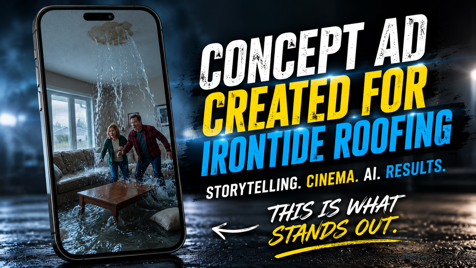
Creating the IronTide Roofing Concept Commercial: From Idea to Final Render
https://www.youtube.com/shorts/jAhA3PpZoEc Creating the IronTide Roofing Concept Commercial: From Idea to Final Render By Richard Huard | ContentForge Many people assume AI lets you press a button and instantly create a polished commercial. The reality is very different. To demonstrate what modern content creation can look like, I created a complete 30-second concept commercial for IronTide Roofing. This was not a commissioned project. It was a creative portfolio piece designed to show what is possible when storytelling, video editing, visual effects, sound design and AI-assisted production are combined. The finished commercial took approximately 15 hours to complete from the original concept to the final render. The Goal I did not want to create another predictable roofing advertisement filled with workers on a roof, generic music and a phone number at the end. I wanted to create something entertaining, memorable and built around a clear story. The central idea was simple: Turn a small roof leak into a ridiculous disaster that homeowners would immediately understand. Humour grabs attention. Storytelling keeps people watching. A clear message helps them remember the business. The Story Behind the Commercial The commercial begins with a quiet exterior shot of a suburban home during heavy rain. Inside, a homeowner notices what appears to be a small leak in the ceiling. That small leak quickly becomes a major problem. The ceiling damage grows, water pours into the living room and the situation escalates until the couple is floating through the house in a yellow dinghy. The exaggeration is intentional. It creates humour while delivering a simple message: Do not wait until a small roof problem becomes a major emergency. The second half of the commercial introduces the roofing crew, shows the repair process and finishes with the home restored. Planning the Commercial Before generating any footage, I planned the story as a series of individual shots. The sequence included: An exterior establishing shot in heavy rain A slow camera move toward the house The first signs of a ceiling leak Progressively worse water damage A flooded living room The dinghy scene The roofing company arrival A short repair montage The restored home A final company message Planning was essential because every generated shot needed to connect with the next one. Without a clear storyboard and shot list, the process would have turned into random experimentation. Creating Consistent Characters and Locations One of the biggest challenges with AI-assisted video is maintaining consistency. The same homeowners needed to appear throughout the commercial. The house, living room, roof damage, clothing and overall lighting also needed to feel connected from one scene to the next. This required repeated prompting, image adjustments and careful shot selection. Some generations looked impressive on their own but did not match the rest of the commercial. Those shots had to be revised, regenerated or replaced. Building the Visuals The project used several tools, with each one serving a different purpose. Photoshop Photoshop was used for image preparation, cleanup and matte-painting work. One of the most important edits involved enlarging the water-damaged section of the ceiling. The original version did not look severe enough, so I created a much larger opening to make the flooding sequence more believable and dramatic. Photoshop was also used to: Repair inconsistent details Clean up generated images Adjust compositions Prepare still images for animation Improve damaged areas of the house Create stronger visual continuity between shots Nano Banana Pro Nano Banana Pro was used to generate and refine several of the still images that became the visual foundation for the video. The goal was not simply to create attractive images. Each image had to be designed with animation in mind. That meant considering camera angle, character placement, movement, lighting and how the shot would connect to the next scene. Kling AI Kling was used to animate many of the still images and create movement within the scenes. This included: Camera movement Water motion Character reactions Environmental movement Roofing repair actions Some shots worked after only a few attempts. Others required multiple generations because the movement looked unnatural, the characters changed or important details disappeared. Veo 3 Veo 3 was used for additional cinematic shots and sequences that benefited from more advanced environmental movement. Using more than one AI video tool gave me greater control over the final result. Different platforms handled different types of shots better. The Dinghy Scene The dinghy scene became the most memorable moment in the commercial. The homeowners are shown floating inside their flooded living room while discussing what began as a small leak. This scene required careful attention because the boat, paddles, water, characters and room all needed to work together. AI generations often introduced problems such as incorrect paddle positions, changing character appearances or unrealistic water movement. Several versions were tested before the scene felt funny, readable and visually connected to the rest of the story. Creating the Roofing Repair Sequence After the exaggerated flooding sequence, the commercial needed a clear shift in tone. The roofing company arrives, the weather improves and the repair process begins. The montage included shots of: The roofing truck arriving A worker approaching the home Ladder and safety equipment Damaged roofing materials being removed Underlayment installation New shingles being placed The repaired roof and restored home The montage needed to feel fast enough for social media while still showing that the company had solved the problem. Editing in DaVinci Resolve All of the generated footage, visual effects, dialogue and sound design were assembled in DaVinci Resolve. This is where the separate images and clips became a finished commercial. The editing process included: Selecting the strongest generated clips Trimming shots for pacing Building the story structure Adding dialogue Adding music and sound effects Creating transitions Colour correction and grading Adding titles and branding Mixing the audio Rendering the final versions The sound design was especially important. Heavy rain, rushing water, ceiling damage, movement inside the room, roofing sounds and the final music all helped sell the story. Without convincing sound, even strong visuals
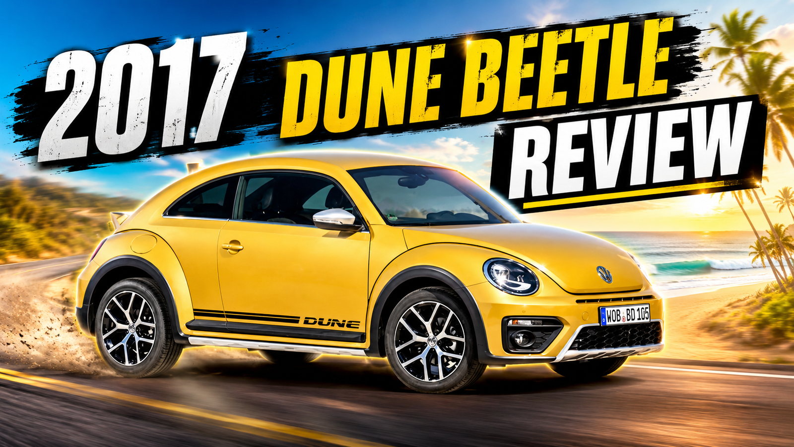
2017 Volkswagen Beetle Dune Review: Building a Vehicle Review from Voice-Over and Stock Footage
2017 Volkswagen Beetle Dune Review: Building a Vehicle Review from Voice-Over and Stock Footage This project was created for a company that publishes written vehicle reviews and other automotive content. The company supplied the completed script for its review of the 2017 Volkswagen Beetle Dune. My role was to transform that written review into a polished video by recording the narration, selecting suitable footage, and editing everything together into a clear and engaging automotive feature. https://youtu.be/wZ67IYFkhSk?si=HbLvlgw2rXNU7tBj The Project The goal was to take an existing written vehicle review and adapt it into a video that felt visually interesting while remaining accurate to the supplied script. Because I was not filming the vehicle myself, the project depended on carefully selecting footage from the stock media made available to journalists by the vehicle manufacturer. The challenge was not simply finding attractive footage. Every shot needed to support what was being discussed in the narration. Recording the Voice-Over I began by recording the full voice-over from the script provided by the client. Recording the narration first established the structure and pacing of the entire video. It allowed me to hear how the written review flowed when spoken aloud and gave me a clear timeline to build the visuals around. During the voice-over editing process, I worked on: Removing mistakes and unnecessary pauses Improving the pacing of the narration Balancing the audio levels Creating a clean and consistent sound Leaving enough room for each visual section to develop Once the narration was complete, it became the foundation for the edit. Filming the Video I filmed the video outdoors beside the river, using the natural environment as part of the visual storytelling. Rather than making the scene feel overly produced, I wanted it to resemble a genuine conversation that someone happened to capture. The performances, pauses, facial reactions, and delivery were important because the humour depended heavily on timing. The outdoor location also helped the video feel more cinematic while keeping the production simple and accessible. Finding the Right Footage The available visuals came from stock footage supplied by the vehicle manufacturer for journalists and automotive media. I reviewed the footage and selected shots that matched the specific details being discussed in the script. This included exterior views, driving footage, interior features, design details, and more creative cinematic angles. The strongest-looking shot was not always the correct choice. The footage needed to match the narration while also creating enough visual variety to keep the viewer interested. Matching the Video to the Narration After organizing the footage, I edited each section to align with the voice-over. When the narration discussed the Beetle Dune’s exterior styling, the video showed the relevant body details. When the script moved into the interior, features, or driving experience, the visuals changed to support those points. The editing process involved: Synchronizing footage with the voice-over Choosing visuals that accurately supported the script Trimming shots to maintain a natural pace Creating smooth transitions between topics Balancing detailed close-ups with wider vehicle shots Avoiding repetitive angles Maintaining viewer interest throughout the review The result was a video in which the narration and visuals worked together rather than feeling like unrelated footage placed over an audio track. Creative Shot Selection Although the footage was provided, there was still a large amount of creative decision-making involved. I selected cinematic driving shots, close-up detail shots, and different exterior angles to give the video energy and variety. These choices helped turn a straightforward written review into something more visually engaging. The goal was to create the feeling of a professionally produced automotive review without distracting from the information being presented. Editing the Final Video The final edit brought together the cleaned voice-over, selected footage, pacing, transitions, and overall visual structure. Each cut was chosen to support either the information in the script or the rhythm of the narration. The video needed to feel smooth and professional while still giving the viewer enough time to appreciate the design of the vehicle. This project demonstrates how existing written content and manufacturer footage can be repurposed into a complete video without requiring a new on-location production. What This Project Demonstrates This project highlights my experience with: Automotive video editing Voice-over recording and editing Script-based video production Stock-footage research and selection Matching visuals to narration Creative shot selection Audio cleanup and pacing Long-form YouTube editing Repurposing written content into video It also demonstrates the ability to work from client-supplied material while making creative editing decisions that strengthen the final presentation. Final Thoughts The most important part of this project was making the visuals feel intentional. When producing a video from stock or manufacturer-supplied footage, it is easy for the final result to feel like a collection of random clips. By recording and editing the narration first, I was able to build the visuals around the story being told. The finished video transformed an existing written review into a professional automotive feature that could reach viewers through a more visual and engaging format. Project Details Project type: Automotive vehicle reviewVehicle: 2017 Volkswagen Beetle DuneClient contribution: Written review and completed scriptMy role: Voice-over recording, voice-over editing, footage selection and complete video editingFootage source: Manufacturer-provided media footage for journalistsFormat: Horizontal YouTube videoCategories: Portfolio, Video Editing Book Your Free Audit Simple intro call. Clear direction. No pressure.
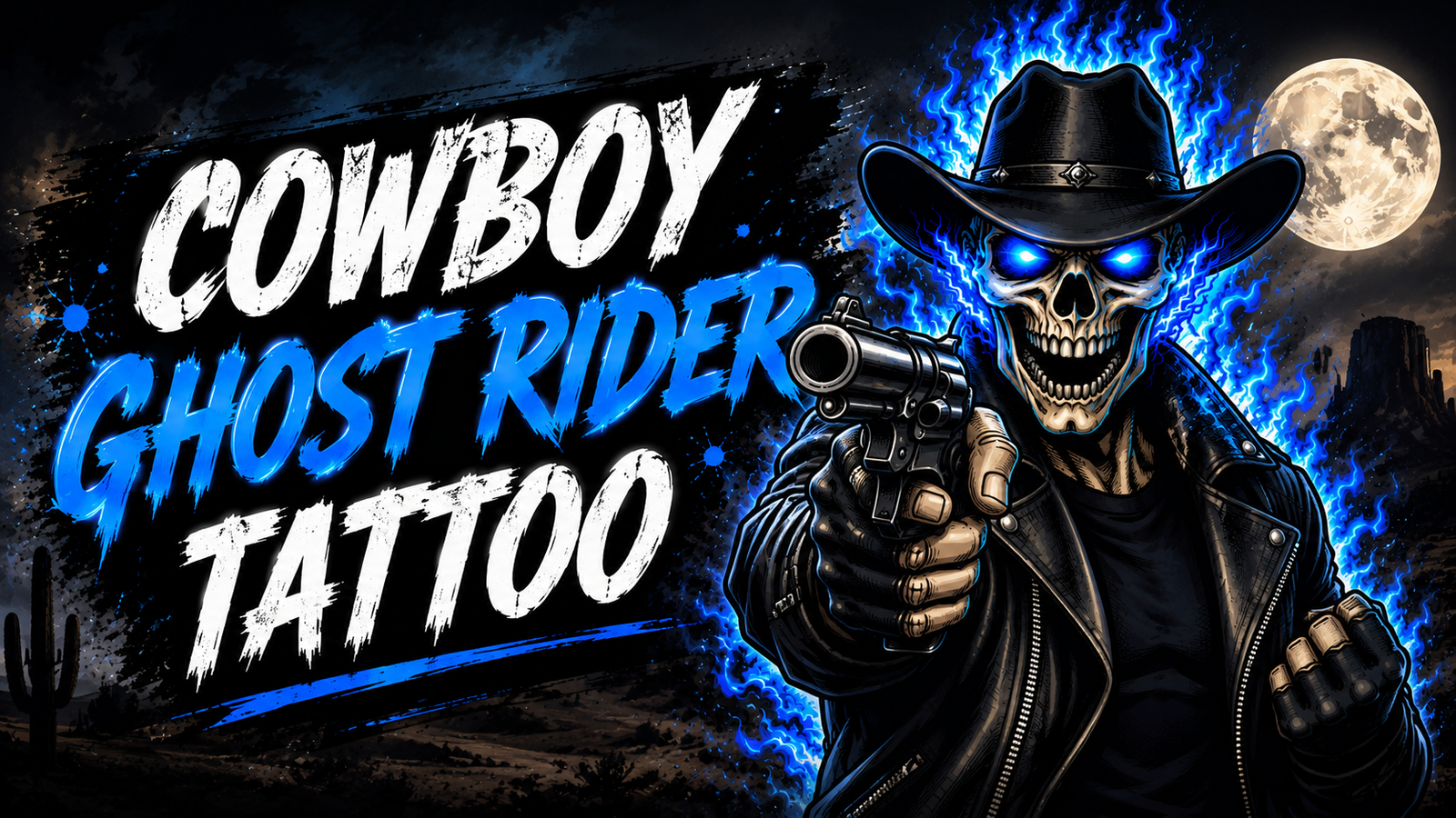
Cowboy Ghost Rider: Creating an AI-Animated Tattoo Reel
Cowboy Ghost Rider: Creating an AI-Animated Tattoo Reel This project featured a custom Cowboy Ghost Rider tattoo inspired by the original character. The customer wanted the familiar flaming skull redesigned with a western look, including a cowboy hat and blue flames. The remaining artwork was completed in black and grey, making the blue flames stand out as the main colour accent. My role was to capture the finished work through photography and a short video clip, then transform that media into a cinematic promotional reel using AI animation and video editing. https://youtube.com/shorts/4wduJHHN5f0?si=y–oyCitwC0htXnl The Reel Concept Rather than presenting the project through a single photograph, I wanted to create a short reel that felt more dynamic and visually engaging. The opening image was animated with AI so the Cowboy Ghost Rider appeared to come to life. This created an immediate visual hook before revealing the real finished artwork. The animation established the mood of the reel and helped connect the imagined character with the final result. Capturing the Visuals I captured a selection of photographs from different angles, along with a short video clip. The goal was to provide enough visual variety to showcase the full composition while also drawing attention to details such as the blue flames, black-and-grey shading, and western character design. The media included: Full views of the finished artwork Close-up detail photographs Different angles of the composition A short video clip showing the artwork naturally These visuals gave me the material needed to build a complete reel without requiring a long filming session. Using AI Animation I used AI to animate the opening image and create the impression that the Cowboy Ghost Rider was coming to life. The animation was not intended to replace the real footage. It acted as a dramatic introduction that captured attention before transitioning into the photographs and video clip. Beginning with motion also created more curiosity than opening with a static image, encouraging viewers to continue watching for the final reveal. Building the Slideshow After completing the animated introduction, I arranged the photographs into a short slideshow. The images were sequenced to gradually reveal the artwork rather than presenting every detail immediately. Subtle movement and effects were added to the still images to keep the reel visually active. These effects included gentle zooms, controlled movement, and smooth transitions. They were kept subtle so the editing supported the artwork instead of competing with it. Adding Video Footage A short video clip was added to break up the sequence of still photographs. This gave viewers a more natural look at the finished artwork and showed how it appeared from a moving perspective. It also helped create more variety within the reel and made the final result feel less like a traditional slideshow. Editing the Final Reel The AI animation, photographs, and video clip were combined into one vertical short-form video. The pacing was kept quick enough for social media while allowing viewers enough time to appreciate the details. Each transition was selected to maintain the energy created by the opening animation. The finished reel combined: AI-assisted animation Creative photography Short-form video footage Slideshow sequencing Subtle motion effects Visual storytelling Vertical video editing Why This Type of Reel Works A single photograph can document finished work, but a well-edited reel can create a stronger experience around it. The animated introduction provides an immediate hook. The following photographs reveal the details from different angles, while the video clip adds movement and authenticity. This format is especially effective for artists, designers, craftspeople, and other visually focused businesses. It allows completed work to be presented in a more memorable and platform-friendly way. What This Project Demonstrates This project highlights my experience with: Short-form reel editing AI-assisted animation Photography and visual composition Capturing short promotional video clips Slideshow pacing and sequencing Subtle image movement and effects Combining still images with video Creating strong opening hooks Repurposing completed work into social content It demonstrates how a small collection of photographs and one short video clip can be transformed into a polished promotional reel. Final Thoughts This project combined photography, AI tools, and traditional video editing to create something more engaging than a basic slideshow. The AI animation gave the reel a dramatic opening, while the real photographs and video footage kept the finished work at the centre of the presentation. This is the type of short-form content that can help creative businesses showcase their work in a way that feels cinematic, memorable, and suited to Instagram Reels, TikTok, and YouTube Shorts. Project Details Project type: Promotional short-form reelSubject: Cowboy-inspired Ghost Rider with blue flamesMy role: Photography, short-form video capture, AI animation, and video editingMedia used: AI animation, photographs, and short video footageFormat: Vertical short-form videoPlatforms: Instagram Reels, TikTok, and YouTube ShortsCategories: Portfolio, Video Editing, AI Book Your Free Audit Simple intro call. Clear direction. No pressure.
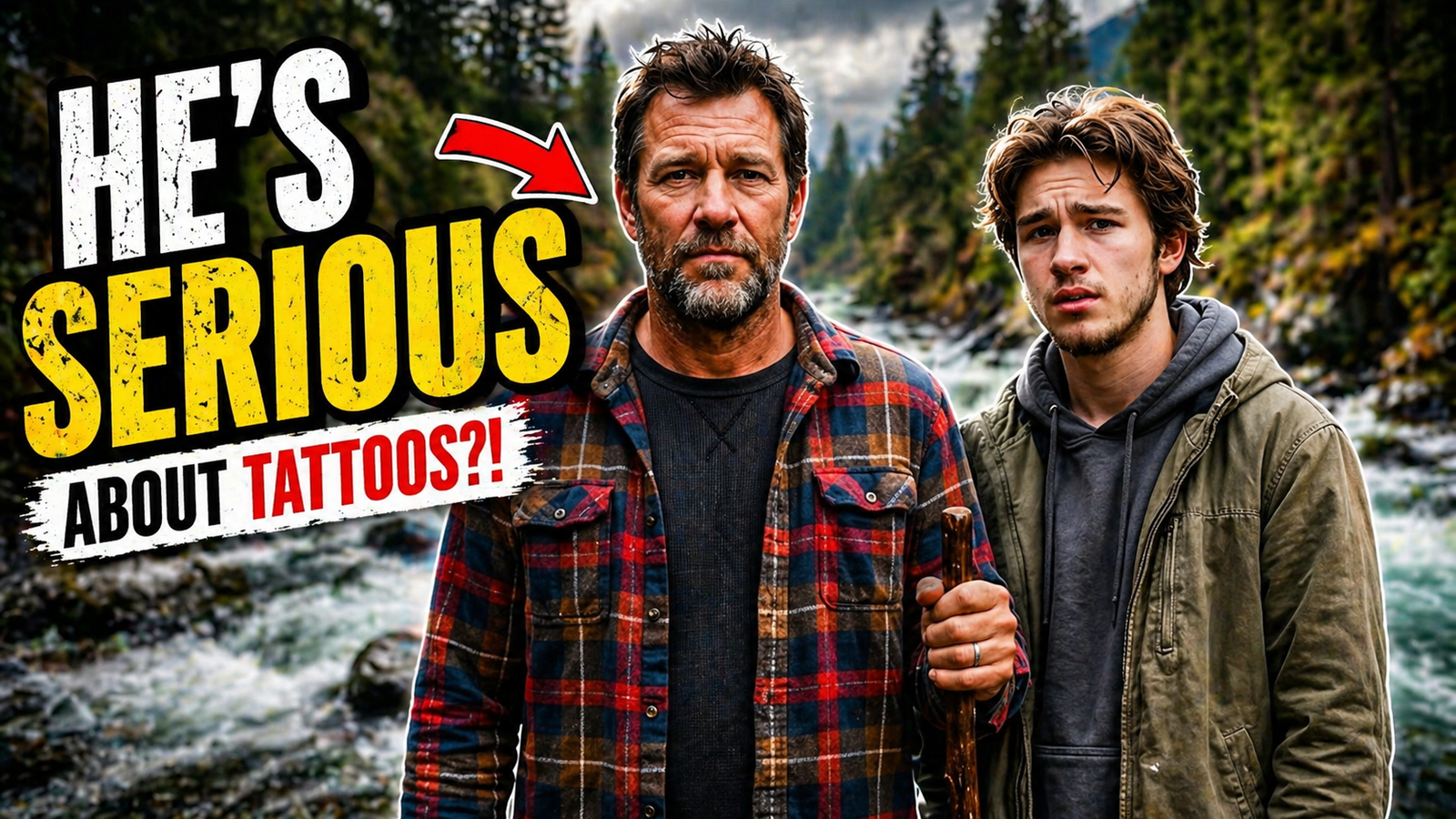
My Dad Thinks Tattoos Get Girls: Creating a Short Comedy Video
My Dad Thinks Tattoos Get Girls: Creating a Short Comedy Video Some video ideas do not need a complicated setup. They need a relatable situation, a strong opening, and good comedic timing. “My Dad Thinks Tattoos Get Girls” is a short comedy video built around a father giving his son some questionable life advice during a quiet visit to the river. The joke begins with tattoos, but the underlying message is really about confidence. https://www.youtube.com/watch?v=jeKkD2DYG5o The Concept The goal was to create a simple, entertaining video that felt like a natural conversation between a father and son. The river provided a relaxed and visually interesting background, while the conversation created the contrast. It begins like a meaningful father-and-son moment before quickly turning into an awkward piece of dating advice. That shift helped give the video a clear comedic payoff without requiring an elaborate storyline or filming location. Script Development Before filming, I worked through the basic concept, dialogue, and structure with AI assistance. The script was kept intentionally short and conversational. Every line needed to move the scene toward the punchline while still sounding like something a father might actually say. The structure was simple: Establish a peaceful father-and-son moment. Introduce the idea of giving life advice. Take the conversation in an unexpected direction. Finish with a quick comedic reaction. Keeping the script focused made it easier to film and helped prevent the joke from being overexplained. Filming the Video I filmed the video outdoors beside the river, using the natural environment as part of the visual storytelling. Rather than making the scene feel overly produced, I wanted it to resemble a genuine conversation that someone happened to capture. The performances, pauses, facial reactions, and delivery were important because the humour depended heavily on timing. The outdoor location also helped the video feel more cinematic while keeping the production simple and accessible. Editing and Pacing The edit focused on maintaining a quick pace without rushing the conversation. I removed unnecessary pauses, selected the strongest performances, and timed the reactions so the final line had room to land. The editing was designed to support the joke rather than distract from it with unnecessary effects. The finished video was formatted as a horizontal YouTube video. A separate vertical version was also created so the concept could be shared through Reels, TikTok, and YouTube Shorts. This allowed the same original footage to be adapted for multiple platforms instead of being used only once. What This Project Demonstrates This project shows how a straightforward idea can become an engaging piece of content through: Concept and script development Humour and visual storytelling On-location filming Performance direction Editing and comedic timing Horizontal and vertical content creation Platform-specific formatting It also demonstrates that effective content does not always require a large production. A clear idea, believable delivery, and intentional editing can carry an entire video. Final Thoughts This was a fun project because it combined storytelling, humour, filming, and editing in a simple format. The biggest lesson was that short comedy works best when the setup is clear and the edit does not interfere with the performance. The joke should feel natural, and the audience should understand the situation immediately. This is the type of content I enjoy creating: personality-driven videos that entertain viewers while still being thoughtfully planned and edited. Project Details Project type: Short comedy videoServices: Concept development, scripting, filming and video editingFormats created: Horizontal YouTube video and vertical social media versionCategory: Portfolio, Video EditingPlatform: YouTube and short-form social media Book Your Free Audit Simple intro call. Clear direction. No pressure.